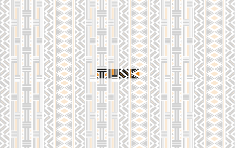
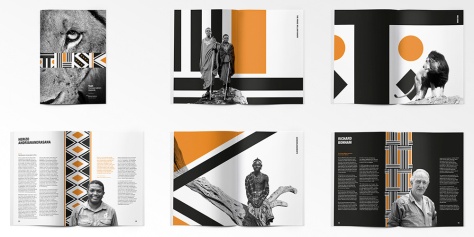
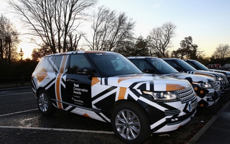
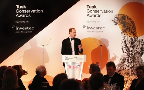
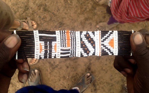
The new logo and identity for Tusk Conservation Awards was developed as a pro-bono project by The Partners. The result is a wonderful integration of design and culture. The bold, graphic wordmark celebrates the focus of the non-profit Tusk organization, which is supporting community development and environmental education throughout Africa.
I love the way the mark is a repeatable graphic, forming a pattern that is distinctly African in feel. It’s a sensitive, thoughtful and fun design that honors the work and mission of the client it represents.
Murmure is likely not the only company to have wondered, “…can you make a business card out of cement?” But, perhaps they are the first (or at least the first published) firm to execute this experiment in an effective way.
Using silkscreen and embossing to illustrate their contact info and logo, respectively, Murmure has created a clever promotional piece that certainly sets them apart.
No designer (or writer, or artist, or doodler) can resist a unique and beautiful sketchbook. Hence, I had to share these.
The wonderfully crisp patterns created by a blind deboss are beautiful and interesting. They also have a lovely hand-made quality to them due to the stitched binding.
All in all, I would be proud to carry one of these into my local coffeehouse or to my next client meeting.
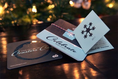
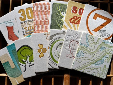
I’ve confessed this before, but…I really do love a fun coaster…
This holiday-themed set is enjoyable primarily because they come pre-stained with a wet glass ring (actually, a varnish). It’s a fun touch that makes an everyday item more unique.
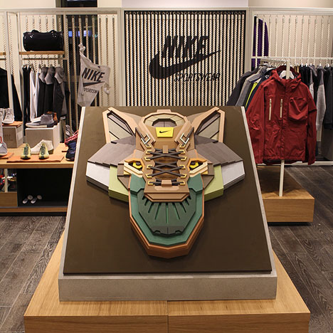
I have never seen anything quite like these colorful dimensional graphics, created by Moscow’s Sicksystems.
The pieces of each composition is carved with a scroll saw, then hand-painted. The result is reminiscent of a cross between totem pole art and something that could be found in a Transformers movie.
The image of the sneaker piece above was one that I found particularly creative. But, click the link to Core 77 for lots of other examples. Great stuff.
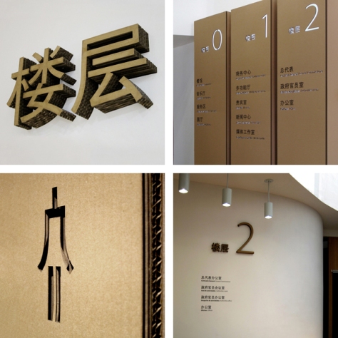
Who would have imagined that die-cut cardboard could be such a wonderful material to use for interior signage? Not I.
Thankfully, designers Isidro Ferrer, Pablo Alabau, and studio Zaragoza Versus were innovative enough to develop this signage system for the Spanish Pavillion at the 2010 Shanghai Expo.
It’s a brilliant idea, if you ask me. Particularly, for short-term, temporary spaces where material waste and expense are things to be avoided, wherever possible. Along these lines, as the article at the link points out, the use of cardboard also has its merits for tradeshow applications: it’s lightweight, recyclable, and inexpensive.
I wonder if this idea – or something similar – will catch on…
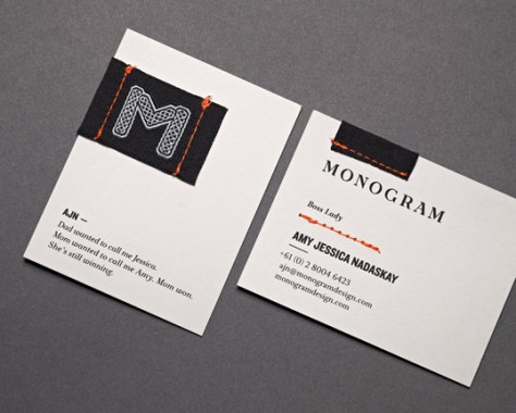
In a time where online communications often trump personal interaction, this identity suite is I nice switch – focusing on tactile elements. And, really, what’s not to love about hand-stitched stationary?
Drink coasters have become the perfect canvas for compact works of art. And, the thick stock provides a great opportunity for experimenting with letterpress and embossing techniques, as well.
This calendar project, for Meadowlark Creative, is a nice collection of playful illustrations to be enjoyed year-round.
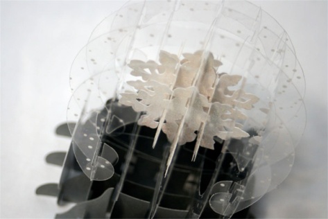
It’s not exactly Christmas season, anymore – the usual time one takes note of snow globes. But the craftsmanship and creativity of this holiday card is really something. It’s certainly one I would keep for posterity.
*cf
Sporadic musings about design, creativity, and the art of communication.