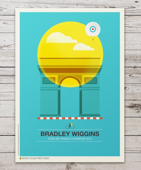
Quick post: The venerable Allan Peters had Neil Stevens’ work posted at his site and I thought I would share it here too. Stevens’ colorful posters are minimalist, but each thoughtful details and a color palette that brings the concept to life.
Below are a few samples, but many more images can be found at the link!
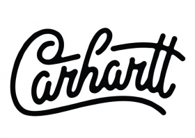
In honor of my status as a relatively new Alaskan, I thought I’d post a typographic homage to Carhartt — the attire of choice for the well-heeled fellow ’round these parts…
Click the link above for more samples at Allan Peters’ blog.
I’m a sucker for fun prints and artwork that have the potential to put a smile on your face. This geometric, colorful animal print from Wee Society features a hidden alphabet amongst the illustrations – entertaining to explore for adults and kids alike.
Click the link for more detailed images and to check out the other offerings from the Wee Society store. They’ve got a good thing going over there!
Fun illustrations and the thoughtful integration of design details, typography, color set the scene for Lima, Peru’s ‘Don Belisario’ restaurant.
The namesake, Don Belisario, is a well-heeled rooster, and portraits of his equally attractive family are also displayed in the restaurant. Throughout the space, it’s clear that the design team sought to — and succeeded in — telling a playful story to create the identity for the establishment. Everything from the napkins to the glassware to the seating feature some element of the Don Belisario brand, creating a truly unique atmosphere in which to share a meal.
Quick post: The contrast presented on this label caught my eye. The minimalist white label and sans serif font, juxtaposed with the energetic illustration of the horse head finished in a glossy varnish make for an interesting composition. The mane of the horse, in particular, gives life to what might otherwise be a very static design.
Allan Peters, Senior Art Director for Target, has posted images of the window graphics created to celebrate the company’s 50th anniversary.
Interestingly, Mr. Peters notes that the photographs were taken with “high-flash” photography to cast a crisp shadow of each model on their respective backdrop (which are Target ads from the 1960s). The shadowing effect, Peters writes, delivers “the perfect blend of past and present.”
It’s a subtle, but effective way to communicate the concept of joining old and new.
These are beautifully textural images from the title sequence of the latest Sherlock Holmes film. I’ve yet to see the film, but the first one was certainly a visual treat, so I expect nothing less of the sequel.
Click the link to Graphic-Exchange above for many more images and an interview with the designer, Prologue.
I stumbled upon the work of Eric Ryan Anderson yesterday (via the wonders of the internets!) and really love the life he is able to capture in his work. The portraits, in particular, remind me of Paul Strand — seemingly un-posed, simply a capture of a moment in time between the tasks of the day.
Check out Eric’s photo blog to see more of his beautiful work.
Enjoy!
*camille
Sporadic musings about design, creativity, and the art of communication.