Quick post: Nice, clean work for a local Denver eatery (not too far from my stomping grounds, incidentally). It’s a crisp one-color production that is easy to read and follow for customers trying to navigate their first meatball order.
I also like the look of the space — hip, modern and casual.
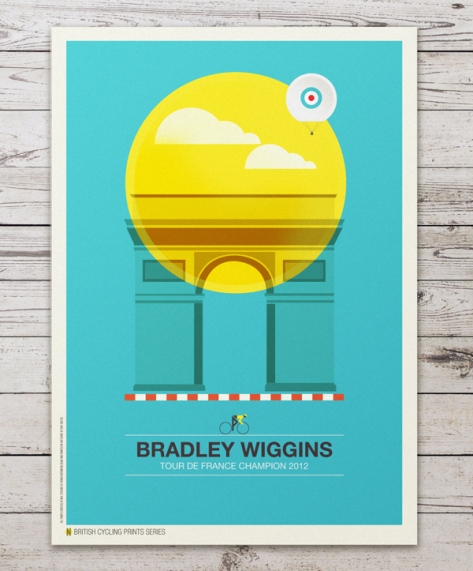
Quick post: The venerable Allan Peters had Neil Stevens’ work posted at his site and I thought I would share it here too. Stevens’ colorful posters are minimalist, but each thoughtful details and a color palette that brings the concept to life.
Below are a few samples, but many more images can be found at the link!
In case you missed it (or haven’t seen this in your area yet), the Chili’s chain is implementing a nice new update to the corporate logo, as well as the classic — but no-longer-interesting — restaurant environment.
The “chili” icon has become more prominent and the wordmark has a new look, as well. In addition, the restaurant facade and interior have a fresher, more lively feel to them. From the colors to the furniture, everything has a lighter feel to it.
I came across the following quote on Jacket Mechanical and thought I would share:
…a good design, whatever its intended use, is an aggregation of many small decisions – each one as important as the next. The resulting design is no more or less than the sum of these decisions. Each choice, no matter how seemingly insignificant, matters.
I’ve come to realize that many people seem to subscribe to the view that there is such a thing as “a design” which exists in the abstract – platonically; independent of its component parts. This belief in turn gives rise to the misapprehension that changing a design (a bigger font here, a different color there, a change in layout) does not, in fact, make for a different design altogether. “We’re keeping the design,” I’m told, “but we want some changes.” Such a thing isn’t possible. These details are the design.
Interestingly, upon reflecting on the impact of film titles, I realize that, though titles are an important aspect of the opening moments of a film, I must confess that (unlike other products of “design”) I only take note of them when they are particularly striking or unique. Otherwise, they tend to fade into memory rather unceremoniously.
The video above is a quick trip through the history of some of the most memorable film title sequences produced. Included are some of my favorite title sequences, such as: those from the television series Dexter, the classic 90’s film, Seven, and the recent James Bond production, Casino Royale (perhaps, my top choice overall).
Looking at these clips, I wonder: Who is it that decides how much creative time and talent to devote to title sequences — the producer…or director? Or, are certain studios or movie genres more apt to utilize the titles as an integral part of the overall film experience?
For his part, designer Saul Bass had his own reflections on the utility and purpose of film title sequences.
Years ago designer Saul Bass explained how he approached film title sequences to me when I interviewed him for an article. “Find an image that will be provocative, seductive yet true to the film,” he said. “It has to have some ambiguity, some contradiction, not only visually but conceptually. Not just isolating the prettiest frame, but finding a metaphor for the film.“
Beginning with his 1955 work on Otto Preminger’s “The Man with the Golden Arm,” Bass transformed the way film title sequences were perceived forever. He approached the task with a graphic designer’s eye, so that stills from his title sequences easily translated into a powerful iconic poster for the movie.
Reducing the visual communications about a film to a single image was a daring notion at the time. Bass recalled that before he did “The Man with the Golden Arm,” films had been promoted with montages consisting of salient elements of the story. “The conventional wisdom on how to sell a film was the ‘see, see, see’ approach,” he said. “See the missionary boiled in soil. See Krakatoa blow its top. See the virgins dance in the temple of doom. The theory was that if you talked a film in pieces, there would be something for everyone.“ This interview with Saul came to mind as I watched “A Brief History of Film Titles” edited by Ian Albinson for the website “Art of the Title.” As the titles in the video folded one into another, I could see where Bass came in and influenced generations of designers of film title sequences thereafter.
World-renowned German industrial designer Dieter Rams defined the latter half of the 20th century with a parade of landmark products. Head of design for Braun A.G. until his retirement in 1998, Rams’ many designs — coffee makers, AV equipment, consumer appliances, calculators, radios, record players, office products – found a permanent home at many of museums, including MoMA. His Universal Shelving System for Vitsoe is still considered as contemporary and functional as it was the day it was introduced. Rams once described his design philosophy as “Less is Better.” In the early 1980s, he pondered the question: What is good design? The result is the 10 principles stated above.
We all have principles that drive us to do what we do in the way that we do it. These are the guiding principles of “good design,” as defined by industrial designer Dieter Rams.
Target continues to lead the pack among retailers in their attention to design. This booklet, put together for the Winter Xgames, is no exception. Designed by in-house designer Aaron Melander, the “Field Guide” is chock full of pretty!
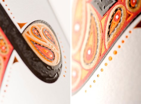
The design of this label is obviously elegant and beautiful. In addition to the aesthetic qualities, though, I was intrigued to read that it was produced using the “Flexo” print technique.
I must admit that I was not familiar with this type of printing, so a quick search revealed the following description (via Wikipedia):
Flexography (often abbreviated to flexo) is a form of printing process which utilizes a flexible relief plate. It is basically an updated version of letterpress that can be used for printing on almost any type of substrate including plastic, metallic films, cellophane, and paper. It is widely used for printing on the non-porous substrates required for various types of food packaging (it is also well suited for printing large areas of solid color).
So, there you go. Perhaps we learned something new together…
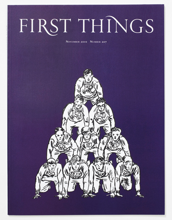
There is something to be said for restraint in design. Pentragram’s re-design of the periodical, First Things, is eye-catching for its bold use of color; but the imperfect illustrations featured on each cover are equally engaging.
Further, the attention to detail is evident in the elegant curves of the “R” and “N” of the publication title, and the structured layout of interior pages (click the link above for images).
I would imagine that seeing these covers on the shelves in 2010 made more than a few passersby stop and have a look.