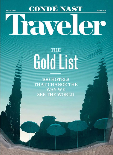
In a way befitting a magazine — and company — secure in its identity, Conde Nast Traveler has revealed a new logo that seems immediately classic.
Indeed, that seems to have been the intent. From the Editor in Chief Pilar Guzman:
“A good logo must feel as though it’s been around forever at the very moment of its debut (thus, one hopes, simultaneously guaranteeing its longevity).”
The new design achieves this delicate balance and, in the words of designer Matt Willey, it is “…capable of being sympathetic to the image that sits underneath it…” rather than drawing attention from it or, conversely, disappearing entirely.
For more about the thought behind the logo and more about the Traveler mission, read the rest of Ms. Guzman’s eloquent post here.
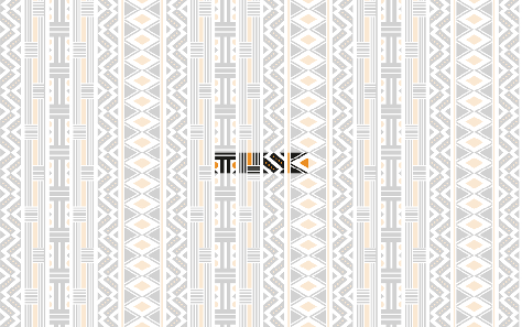
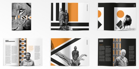
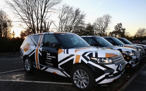
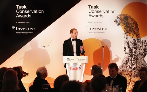
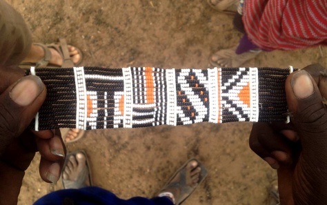
The new logo and identity for Tusk Conservation Awards was developed as a pro-bono project by The Partners. The result is a wonderful integration of design and culture. The bold, graphic wordmark celebrates the focus of the non-profit Tusk organization, which is supporting community development and environmental education throughout Africa.
I love the way the mark is a repeatable graphic, forming a pattern that is distinctly African in feel. It’s a sensitive, thoughtful and fun design that honors the work and mission of the client it represents.
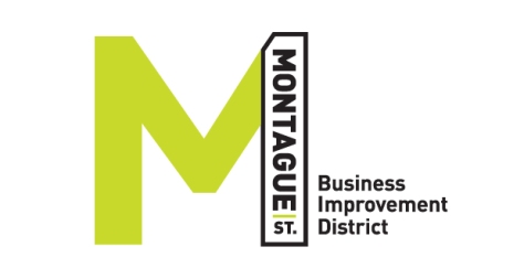
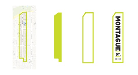
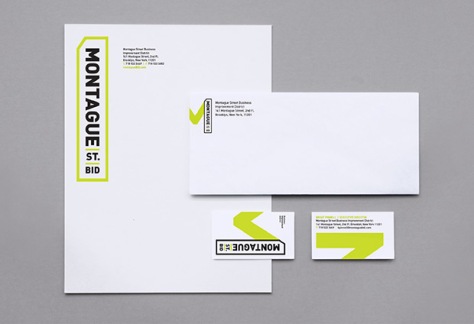
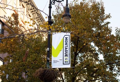
This new logo provides an identifying mark for a 3-block district in Brooklyn Heights. Cleverly, the designers extrapolated the shape of the district and made it a key element of the graphic identity.
The overall mark is clear, legible and, as is evident from the mockup images, it provides ample options for integrating into the broader campaign.
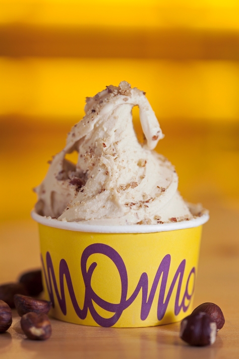
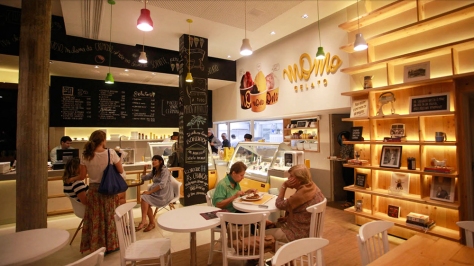
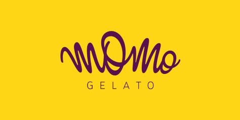
As soon as I laid eyes on this fun logo, I was hankering for a cup of gelato. The free-spirited graphic and bright — but sophisticated — color scheme are very appealing. The same aesthetic is carried through to the store interior and collateral illustrations.
The swoopy (that’s a technical term) script is also nicely paired with the orderly “G E L A T O” that anchors the mark. All together, it’s a strong execution that seems to successfully convey both quality and approachability.
“You can call me Delicious, you can call me Creamy. But please: Just don’t call me ice-cream, ‘perché io sono un gelato!’”
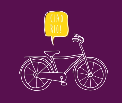
I’m just gonna call a cab to the airport so I can head to Rio.
Guy Fieri’s new restaurant in NYC’s Times Square is as brash and quirky as he is. But I like the pseudo-patriotic take on the logo and the all-American feel of the interiors.
It has a sports-bar feel, but there are plenty of interesting design details that make it a unique spot. American flags, antlered-animal heads, varied materials, custom light fixtures, signage….It all comes together to create a fun experience for patrons. This particular restaurant is certainly worthy of being in one of the most lively urban spots in the world.
In a clever use of their bold and chunky logo, SA Bar uses the logo’s form to present food and drink images throughout their menu. Not only does it add a nice thread of consistency, it makes the usual ‘beer’ pic a little more interesting.
Typically, logo designers working with Regular Businesses design with practical considerations in mind: “What does this look like in one color?”, “Does it fax well?”, “Can it be executed consistently across all media?”, etc.
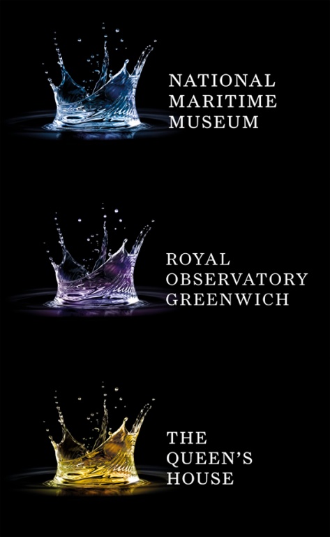
In an interesting (and well-executed) switch, the designers of the new logo for the National Maritime Museum thought outside of the logo box and created a very appropriate and beautiful 3-dimensional “splash” identity that is a pleasure to see in all its different uses (click the link to see images). As a bonus, the hidden imagery in the rendering makes the mark all the more fun to take in (do you see the ‘crown’ representing the Queen?).
While this is not necessarily the most practical of designs, I look forward to seeing how the identity is used over time…and whether it inspires more experimentation with the definition of a “logo.”
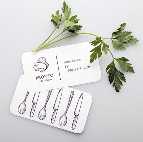
The simple illustrations featured on this set of cards for an Italian eatery (Pronto) in Moscow are pleasantly executed and, presumably, let the food do the talking.
Though Pronto is a chain of restaurants, the stationary gives a sense that there is an old-school chef carefully preparing each and every dish.
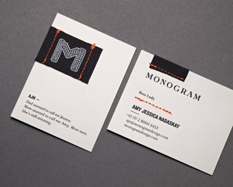
In a time where online communications often trump personal interaction, this identity suite is I nice switch – focusing on tactile elements. And, really, what’s not to love about hand-stitched stationary?
*camille
Sporadic musings about design, creativity, and the art of communication.